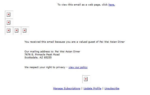
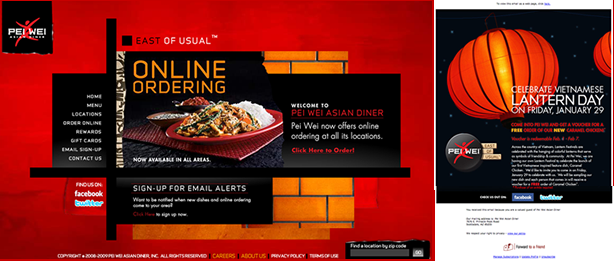
First off, I love Pei Wei - great food and affordable prices. The other day though I received this email in my inbox:
Look closely, what do you see? Not much here for me to take away, but at least I'm a valued guest. So as a fan of Pei Wei, I'm going to offer up some advice on how they can make some minor improvements to their email marketing efforts and improve their overall success, and you can too!
1. Be aware of potential delivery issues
The from name is good, I quickly know this is an email from one of my favorite restaurants, Pei Wei. The subject line is good as well, as I'm expecting a free voucher on a new item. The problem though, was this was put in my junk folder (after releasing it from my spam filter). I'll save all the details about spam filters for a later post as their are many factors that can play a role in getting blocked: reputation, email size, text to image ratio, content and a laundry list of many other factors play a very important role and help explain why this email didn't make it to my inbox. Proper testing and monitoring can help limit the likely hood of getting caught in filters. Make sure to monitor your programs this year to help limit the likelihood of getting junked! And remember email delivery doesn't equal number of emails sent minus number of bounced.
One other thing to note is some email clients will display a warning to the subscriber if the click a link within an email that was placed in the junk folder. This is another reason why staying out of the junk folder is very important.
2. Know the inbox - not everyone will see your "entire" email
Not everyone will see the whole email, so you need to take into consideration preview panes and how your email looks to those viewing email within these panes. Luckily there is only two types - horizontal and vertical. If your call to action is too far to the right, or too far down in the email, it has a greater chance of being missed by this audience. Remember, people are busy and move quickly so make it easy for them to take action.
3. Images are worth a thousand words but when turned off they are worth none
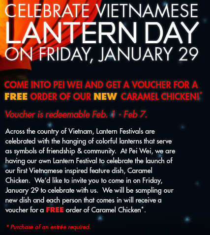
Imagery can really help add to your messaging, but when your whole email is an image and images are turned off by default, you are essentially saying nothing at all. Images should be used to enhance the overall message and call to action. So in this email from Pei Wei it would have been great to see a voucher, or even the new dish. In this email, your copy becomes invisible without enabling images, and the imagery is focused on the holiday event...incorporating some of this other imagery would help get this message across far easier than having to read and decipher the entire content of the email.
4. Add Content (but not as an image)
Similar to the last point, your textual content (unless it is brand related and requires a certain font type) should be placed into the email so when images are off it is still visible. This comes in handy when someone may be getting this email on their mobile device like Blackberry or Windows mobile device.
5. Clear call to action
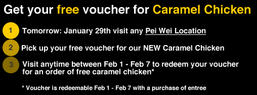
Make sure it is clear to the subscriber on what is is they need to do next, and make it very apparent. Here is a quick mock up I created in order to drive home the simplicity that could have been added to this email. (Sorry for the lack of design, I was in a hurry to mock this up.)
In this layout, you can quickly see the things you need to do in order to get your Free Caramel Chicken dinner. I don't need to read through tons of copy in order to learn about what is needed to take advantage of this offer.
6. Keep your promotions simple and measurable
In the Pei Wei email, there is no call to action. Finding the nearest location should be front and center. This will help Pei Wei determine if people are interested in the offer. If not, maybe future offers should be adjusted in order to create more interest among their subscribers. Adding a printable coupon or show this email to the cashier will also help determine the traffic generated from the campaign. Over time, you can start to tailor your offers to each subscribers interests (opens, clicks, bounces, etc.).
7. Utilize space efficiently
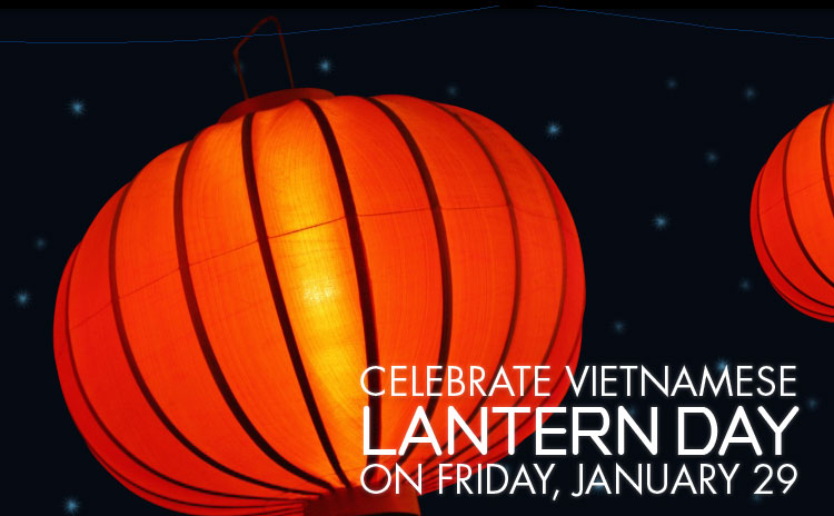
The canvas for your email is somewhat limited, add in preview panes and various monitor sizes and your really left with 600 pixels of good horizontal space. As mentioned before in bullet two, you want to keep your important information higher up in the email so your "canvas" becomes pretty small. As you can see in the Pei Wei example the content of the email is pretty far down from the top, with the top adding no value to this communication. This layout may work well as a print ad, but email is an entirely different medium. Space becomes extremely important, make every pixel count.
8. Add viral components to your campaign
Email was the first form of social media, you can forward email to friends and family to spread the message. Now more and more email service providers are incorporating sharing with social networks into their software. What better way to get your email to work harder for you then to give your subscribers the capability to spread your message and promotion through forward to a friend and share with your network. In this case, let the subscriber promote this offer through their facebook or twitter accounts. Kudos to Pei Wei for including references to their social accounts, but "check us out on" is missing the point of what happens there...interactions and conversations with people who have the same interests in Pei Wei!
9. Use the opportunity to further your brand
Use your ongoing communications to continue to build upon your branding. Don't send your subscribers a new, redesigned email every time you send an email. It will take your subscribers "time" to make sure that what they are looking at is really an email from you. By keeping colors and fonts similar, you lessen the time it will take them to familiarize themselves. That doesn't mean you can't create campaigns that add in new elements, but keep a few of the elements the same. It is interesting to see that Pei Wei has chosen to move there logo to the lower portion of the email versus front an center to ease the subscribers mind that - yes, this is an official Pei Wei email, not spam...even though this was in my spam folder.
10. Analyze the post click experience
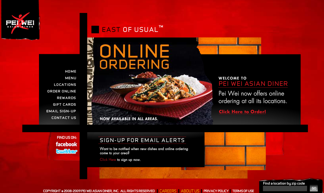
Where are you sending the subscriber? Does the page the subscriber land on match link they clicked? In the case of this Pei Wei email, it took me to the home page (which for some reason wasn't working in Safari). Not bad since the same lantern promotion was a feature on the home page, but landing on the promotion page would have been a far better landing area. Make sure to use your web analytics to track your email subscribers and see what they do when they visit the site. You'll be surprised on the results you may find!
Bonus tip: Stay away (far away) from linking generic text like "here" or "click here." This adds zero value to the reader, especially those who scan the information in front of them. Use the opportunity to explain what they will get when they click - Visit our website, Download 10% off coupon...
If you try some of these out on your own email campaigns, leave a note in the comments and share some the results you get!
First off, I love Pei Wei - great food and affordable prices. The other day though I received this email in my inbox:

Look closely, what do you see? Not much here for me to take away, but at least I'm a valued guest. So as a fan of Pei Wei, I'm going to offer up some advice on how they can make some minor improvements to their email marketing efforts and improve their overall success, and you can too!
1. Be aware of potential delivery issues


The from name is good, I quickly know this is an email from one of my favorite restaurants, Pei Wei. The subject line is good as well, as I'm expecting a free voucher on a new item. The problem though, was this was put in my junk folder (after releasing it from my spam filter). I'll save all the details about spam filters for a later post as their are many factors that can play a role in getting blocked: reputation, email size, text to image ratio, content and a laundry list of many other factors play a very important role and help explain why this email didn't make it to my inbox. Proper testing and monitoring can help limit the likely hood of getting caught in filters. Make sure to monitor your programs this year to help limit the likelihood of getting junked! And remember email delivery doesn't equal number of emails sent minus number of bounced.
One other thing to note is some email clients will display a warning to the subscriber if the click a link within an email that was placed in the junk folder. This is another reason why staying out of the junk folder is very important.
2. Know the inbox - not everyone will see your "entire" email


Not everyone will see the whole email, so you need to take into consideration preview panes and how your email looks to those viewing email within these panes. Luckily there is only two types - horizontal and vertical. If your call to action is too far to the right, or too far down in the email, it has a greater chance of being missed by this audience. Remember, people are busy and move quickly so make it easy for them to take action.
3. Images are worth a thousand words but when turned off they are worth nothing

Imagery can really help add to your messaging, but when your whole email is an image and images are turned off by default, you are essentially saying nothing at all. Images should be used to enhance the overall message and call to action. So in this email from Pei Wei it would have been great to see a voucher, or even the new dish. In this email, your copy becomes invisible without enabling images, and the imagery is focused on the holiday event...incorporating some of this other imagery would help get this message across far easier than having to read and decipher the entire content of the email.
4. Add Content (but not as an image)

 Similar to the last point, your textual content (unless it is brand related and requires a certain font type) should be placed into the email so when images are off it is still visible. This comes in handy when someone may be getting this email on their mobile device like Blackberry or Windows mobile device.
5. Clear call to action
Make sure it is clear to the subscriber on what is is they need to do next, and make it very apparent. Here is a quick mock up I created in order to drive home the simplicity that could have been added to this email. (Sorry for the lack of design, I was in a hurry to mock this up.)

In this layout, you can quickly see the things you need to do in order to get your Free Caramel Chicken dinner. I don't need to read through tons of copy in order to learn about what is needed to take advantage of this offer.
6. Keep your promotions simple and measurable
In the Pei Wei email, there is no call to action. Finding the nearest location should be front and center. This will help Pei Wei determine if people are interested in the offer. If not, maybe future offers should be adjusted in order to create more interest among their subscribers. Adding a printable coupon or show this email to the cashier will also help determine the traffic generated from the campaign. Over time, you can start to tailor your offers to each subscribers interests (opens, clicks, bounces, etc.).
7. Utilize space efficiently

The canvas for your email is somewhat limited, add in preview panes and various monitor sizes and your really left with 600 pixels of good horizontal space. As mentioned before in bullet two, you want to keep your important information higher up in the email so your "canvas" becomes pretty small. As you can see in the Pei Wei example the content of the email is pretty far down from the top, with the top adding no value to this communication. This layout may work well as a print ad, but email is an entirely different medium. Space becomes extremely important, make every pixel count.
8. Add viral components to your campaign

Email was the first form of social media, you can forward email to friends and family to spread the message. Now more and more email service providers are incorporating sharing with social networks into their software. What better way to get your email to work harder for you then to give your subscribers the capability to spread your message and promotion through forward to a friend and share with your network. In this case, let the subscriber promote this offer through their facebook or twitter accounts. Kudos to Pei Wei for including references to their social accounts, but "check us out on" is missing the point of what happens there...interactions and conversations with people who have the same interests in Pei Wei!
9. Use the opportunity to further your brand

Use your ongoing communications to continue to build upon your branding. Don't send your subscribers a new, redesigned email every time you send an email. It will take your subscribers "time" to make sure that what they are looking at is really an email from you. By keeping colors and fonts similar, you lessen the time it will take them to familiarize themselves. That doesn't mean you can't create campaigns that add in new elements, but keep a few of the elements the same. It is interesting to see that Pei Wei has chosen to move there logo to the lower portion of the email versus front an center to ease the subscribers mind that - yes, this is an official Pei Wei email, not spam...even though this was in my spam folder.
10. Analyze the post click experience

Where are you sending the subscriber? Does the page the subscriber land on match link they clicked? In the case of this Pei Wei email, it took me to the home page (which for some reason wasn't working in Safari). Not bad since the same lantern promotion was a feature on the home page, but landing on the promotion page would have been a far better landing area. Make sure to use your web analytics to track your email subscribers and see what they do when they visit the site. You'll be surprised on the results you may find!
Bonus tip: Stay away (far away) from linking generic text like "here" or "click here." This adds zero value to the reader, especially those who scan the information in front of them. Use the opportunity to explain what they will get when they click - Visit our website, Download 10% off coupon...
If you try some of these out on your own email campaigns, leave a note in the comments and share some the results you get!


